Being a computational biologist, I often have to deal with large datasets and, in order to get rapid insight into the structure of that data, visualisation is a key tool. What I'm usually trying to achieve is to turn complex data into a static image that is easier for my mind to process quickly - taking advantage of pattern recognition skills we all share that were honed by natural selection. One approach is to lay out, or project, data spatially so that - say - 'similar' things are close together and 'different' things are not, enabling the viewer to identify for themselves what appear to be members of a common class. If, though, we know something about the classes of datapoints already, we can use colour to represent that class, and look for patterns in the colour distribution, such as whether the projection agrees with the colour classification or not.
 | |
|
- Rather obviously, some people (usually males) are colourblind, so some colours that appear distinct to me (I am, luckily, not colourblind) do not appear so distinct to others. Less obviously, cultural and other acquired differences can apparently contribute to colour perception. This might result in members of distinct classes being confused with each other.
- Aside from colourblindness, another reason that colour is not the only distinction we might wish to make is that people often print colour images in greyscale. This is not a unique mapping, as several colours may be translated to the same brightness of grey. Also, the user has a free choice of greyscale mapping techniques and, depending on that choice, different colours may map to the same shade of grey. This might also result in members of distinct classes being confused with each other.
- For a handful of different classes, it's straightforward to select colours manually using a colour picker tool in whatever software is to hand. For a large number classes, I find this impossible. Recently, I wanted to distinguish (as much as I could) between over 150 classes of datapoint. Trying to do this reliably by hand would be silly, and it motivated me to write an automated colour picker.
The Colour Spiral
The first thing that came to mind was this piece by Bang Wong, the Broad Institute's Creative Director, in Nature Methods, that described the use of one representation of colour, HSV colour space, to select mutually-discernible colours.
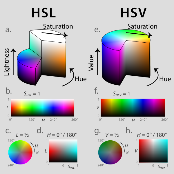 |
| HSL and HSV colour spaces. Jacob Rus/Wikipedia |
The basic idea is that HSV colour space describes a cylinder. Looking down upon the cylinder so that you see the top surface as a circle or colour wheel, the six additive primary and secondary colours of red, yellow, green, cyan, blue and magenta are each separated from their neighbours by 60°, and the intermediate colours around the edge of the circle are linear mixtures of the adjacent colours. If we imagine taking slices through the cylinder from top to bottom, we are essentially adding more black, or shade, to the colour. Moving from the edge to the centre of the colour wheel, we are essentially adding more white to the colour to produce tints.
In his piece, Bang Wong describes the selection of discernible colours by drawing a spiral from the centre to the edge of the HSV colour wheel, and making these also discernible in grey scale by considering this spiral to run from a 'light' part of the cylinder to a 'dark' part of the cylinder. The resulting colours will then also have distinct 'brightness', and so be distinguishable when printed in greyscale.
Building the Colour Picker
Inspired by this idea, I thought that a productive way to go would be to consider a cylinder of unit radius and unit height to represent the HSV colour space, and choose a spiral corresponding to Bang Wong's colour selection idea. This spiral could be parameterised to start at the cylinder axis and end at its outer surface, and also to start and end at two distinct heights in the cylinder. Then, I could select an a number of distinct points along the spiral's path, one for each data class, and these would be my colours. That, then, would be my colour selection algorithm. There are, though, quite a few different types of spiral, so I had to choose one.
I wanted a spiral that was easy to parameterise, and Bang's figure looked like he had used a logarithmic spiral in his example. This is a simple and visually-pleasing spiral, which has interesting mathematical properties, including being self-similar. It is also very easy to describe in cylindrical co-ordinates. The whole spiral is defined in this framework by  , where r is the distance from the origin of a point on the spiral where the spiral has 'turned' through an angle
  , and the parameters a and b determine the shape of the spiral. Parameters a and b effectively determine the starting direction of the spiral, and the number of times it circles the origin.
The arc length - the distance along the spiral from its start to the point where it has turned through an angle is given by  . This allows us to 'pin' the spiral at the edge of the cylinder, and calculate the locations of an arbitrary number of points - each of being a distinct colour - on the spiral. For the position of the point in the z-coordinate, i.e. vertically within the cylinder, we can calculate a height between the start and end of the spiral that is linearly related to the position of the point along the spiral's arc, and this is the brightness value v.
Since we're dealing with a cylinder of unit radius, for any values of a and b, the 'end point' of the spiral is at a radius r=1, so we have , and from this we can easily calculate values of r and at any number of points along the curve. Since r corresponds to saturation, to hue, and v to value in the HSV colour space, by parameterising a and b, and specifying a start and end brightness (vi and vf), we can define a spiral that passes through HSV space, and readily select an arbitrary number of points, i.e. colours, along its length.
As you can see, the rainbow colouring (selected by choosing appropriate parameters a and b) is mostly consistent with the positioning of the conserved regions across all genomes, indicating that they're similarly-positioned across most of the genomes. However, the variations from this colour mapping are quite visible, as are the 'leading lines' of obvious inversions and rearrangements. Using jitter allows me to distinguish quite clearly between neighbouring regions of similar colour that would otherwise be so similar that they could be confused. I thought it was pretty successful.
The arc length - the distance along the spiral from its start to the point where it has turned through an angle
Since we're dealing with a cylinder of unit radius, for any values of a and b, the 'end point' of the spiral is at a radius r=1, so we have
 |
| Spiral of 16 colours selected by the colour spiral algorithm, positioned in HSV space. |
Jitterbug
I built the code to describe this selection process but noticed that, when selecting a large number of colours, it could be very difficult to distinguish adjacent colours of similar brightness. I decided that, since I wanted to preserve the spiral colour selection, I could easily vary the brightness of adjacent points by adding jitter - a random component - to the selected brightness. This would preserve continuity of colour choice, but help to distinguish adjacent very similar colours. I chose to parameterise jitter by an absolute brightness value j, which is used to define the range of a uniformly-distributed random variable for brightness [v-j, v+j] for each point, where v is calculated as before. This allows us to select a very large number of colours - 625 in the image below - along a fairly short spiral, while maintaining a visible difference between (most of the) adjacent colours. |
| Grid of 625 colours chosen by the colour spiral algorithm. |
Colour Conversion
So far we've been working in one colour space: HSV. However, I wanted to use these colours in the context of the ReportLab toolkit in Python, and this works in a different colour space: RGB. There are algorithms for doing this but, happily, Python has the colorsys module, which took care of all the grunt work for me, and allowed me to move directly from cylindrical co-ordinates to RGB colourspace.What's it all about, in the end?
The biological motivation for all of this was a set of 156 'core' collinear regions conserved between the genomes of 29 representatives of a bacterial genus. I wanted to show these on a single diagram, using Biopython's GenomeDiagram library, and I wanted to have distinguishable, unique, and (hopefully) aesthetically non-jarring colours for each of the regions. My thought was to have a 'rainbow' of colours from one end of each genome to the other so that rearrangements would be implied by 'distortions' of the rainbow where colours appeared to be out of place. Conceptually, this combines the projection idea with the distinguishing colour idea, where (expected) location on the genome is the class, projected into physical space on the diagram in the usual way, but also into colour space. |
| GenomeDiagram image of 29 bacterial genomes, indicating conserved collinear regions, coloured using the colour spiral algorithm. |
As you can see, the rainbow colouring (selected by choosing appropriate parameters a and b) is mostly consistent with the positioning of the conserved regions across all genomes, indicating that they're similarly-positioned across most of the genomes. However, the variations from this colour mapping are quite visible, as are the 'leading lines' of obvious inversions and rearrangements. Using jitter allows me to distinguish quite clearly between neighbouring regions of similar colour that would otherwise be so similar that they could be confused. I thought it was pretty successful.
Nice - our six month wait for a large scale GenomeDiagram with crosslinks was worth it :)
ReplyDelete